Building a design system
Wed Nov 09 2022
I explore the evolution, key components, and practical challenges of creating a cohesive design system, offering valuable guidance for developers and designers alike.
Watch this video that summarizes the blog post:
When I began researching design systems, I was surprised to discover the numerous definitions of what a design system actually is.
If you asked me to define a design system, my answer would have varied depending on the year. Ten years ago, I would have described a design system as a CSS library or a style guide for writing CSS and structuring HTML. Five years ago, I might have said it's a set of components used to build applications. Recently, with the rise of design systems like Material and Fluent, their descriptions have become more abstract, almost likened to a superhero entity rather than a mere framework. Let's attempt to clarify what a design system really is.
As an engineer, I understand the purpose of a style guide and CSS frameworks. It's tempting to simply view a design system as a library of components. However, a design system should offer more than that: its components must be coherently designed and consistently implemented, not just assembled from various sources into a shared library. A design system provides clear guidelines on the appearance, implementation, and integration of components. It defines not only what a component is used for but, perhaps more importantly, what it should not be used for.
Beyond these technical aspects, for me, a Design System (DS) serves as a common language bridging design and development. A well-crafted system not only empowers designers to engage with coding but also enables engineers to participate in the design process. Realizing this might sound a bit abstract, let's delve into the more concrete details.
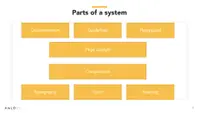
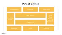
We've discussed components and guidelines, which are a solid foundation. However, a Design System (DS) encompasses much more than just these elements.
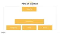
There should be an even more granular aspect to the components of a Design System (DS). These are the tokens. Tokens represent the smallest parts of the design system, serving as the fundamental building blocks of the components. The most apt definition I've come across is that tokens are context-agnostic primitive values that define visual styles.
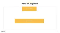
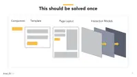
Above the components, we have page layouts. These layouts serve as the structural backbone, or the skeleton, of the page. They define the grid system and the spacing between components. To achieve a consistent layout, it's essential to:
Know Your Use Case: Understand the purpose and utilization of the information on the page.
Prioritize Your Content: Strategically organize content to emphasize the most crucial information.
Group Related Content Together: This ensures efficiency and ease for users when navigating and interacting with the content. Beyond guidelines, another critical aspect is the presence of documentation and playgrounds. A golden rule in design systems is: if it's not documented, it doesn't exist. Playgrounds provide a practical space where you can observe components in action, understanding their usage and behavior.
How does the user interact? Which devices are being used? What environments do these interactions occur in? At what times do users typically engage with the system?
Let's spend a few minutes discussing interaction models, as well as the voice and tone of user interfaces, highlighting their importance.
What is an Interaction Model? An interaction model addresses how users interact with a system, considering the devices used, the environments in which these interactions occur, and the timing of these interactions.
Take, for example, my company, which develops software for managing medical centers and patient engagement. Here's a typical user flow: Before taking an exam, a patient needs to fill out a form. Our platform sends an SMS with exam preparations and a link to the online form. The patient has the flexibility to complete parts of the form online and the remainder on paper at our center. Additionally, there's a screening form that the patient may need to answer, which is also used by the technologist.
This scenario presents various environments, devices, and communication mediums through which the patient interacts with our product. It's crucial to ensure the patient feels comfortable and confident with these interactions. For instance, the paper forms should mirror the look and feel of the online forms to facilitate a smooth transition and avoid patient confusion.
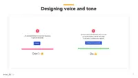
Building on the previous example, we can see that the voice and tone of the product are also crucial. Different communication formats require tailored approaches. For instance, SMS messages need to be short and concise, while forms demand thoroughness and clarity. In screening forms, an empathetic and supportive tone is essential. However, across all these formats, it's important to maintain a consistent language that builds trust and confidence in the product.
In the slide's example, the voice used in an error message plays a significant role in building trust with users. It helps the product stand out and maintain consistency by reflecting the brand's personality. The tone of the message, incorporating elements like empathy and humor, adds clarity and a personal touch to the product, enhancing user engagement and experience.
Now that we have a clearer understanding of what a design system is, let's discuss whether we should build one.
Before diving in, have a look at a brief YouTube video I've put together that outlines the key components of a design system.
The key to answering whether to build a design system lies in asking yourself a series of questions. Are there 'villains' lurking in the shadows of your project? Are you grappling with recurring problems that seem unsolvable? Think of these villains as well-defined and clearly identified problems. In the realm of design systems, these challenges are often quite evident. The goal is to highlight these issues and address them effectively — like bringing in a hero to vanquish these villains.
Let's start by identifying our villains.
Inefficiency
Redundant Component Creation: One major issue is the repetitive building of the same components. This not only consumes valuable time and resources but also leads to inconsistency across the project. Multiple Changes Required: Another challenge is the need to make changes in several places for a single update. This can lead to errors and inconsistencies, making the process inefficient and cumbersome. Costly Redesigns: Redesigning components or sections of a project can be an expensive affair. It's not just about the direct costs; it also involves the time and resources spent in redoing work that could have been done correctly the first time. To put it in perspective, “...the inefficiencies that a medium-sized team might manage are disastrously wasteful for a team of our size.” This statement underscores the amplified impact of inefficiency in larger teams, where the scale of the project magnifies every redundant task and misstep.
Insecurity
Lack of Confidence in Building and Designing: A common issue is the uncertainty developers and designers face when creating new components. This lack of confidence can stem from a variety of sources, such as unfamiliarity with the overall design language or uncertainty about the project's direction. Unclear Best Practices: Another factor contributing to insecurity is the ambiguity about best practices. Without clear guidelines, team members may question whether they are following the most efficient and effective methods in their work. Reuse of Components: Often, there is uncertainty about the reusability of existing components. Developers and designers might not know if they can, or should, reuse components, leading to unnecessary duplication of effort. Component Suitability: Frequently, team members are unsure if there already exists a component that fits their specific use case. This uncertainty can lead to the creation of redundant components or the misuse of existing ones, affecting the coherence and efficiency of the project. These insecurities, while seemingly minor, can significantly impede the progress of a project, leading to delays, decreased productivity, and a fragmented design approach.
How do the components look? How do they function within a form? How does the form fit into the overall layout? And how do these scenarios play out across different interaction models?
Inconsistenc
y
Varied Approaches to Similar Actions: A key issue is when the same user actions are executed differently across various parts of the application. This lack of uniformity can stem from different team members interpreting design guidelines differently or from updates that don't get uniformly applied across all components.
Impact on User Confidence: This inconsistency can lead to users losing confidence in the product. When users encounter different behaviors for similar actions, it disrupts their learning and adaptation process. They might find themselves having to relearn how to perform tasks they previously understood, leading to frustration and a diminished user experience.
Increased Cognitive Load: Inconsistent design increases the cognitive load on users as they navigate through different parts of the application. Instead of a seamless interaction, users are forced to constantly adjust to varying interfaces and controls, which can be both confusing and time-consuming.
Challenge in Maintaining Brand Identity: Consistency is also vital for maintaining a strong and recognizable brand identity. Inconsistent design elements can dilute the brand's message and make the product feel disjointed, ultimately affecting the overall perception of the brand. Addressing these inconsistencies is crucial for providing a smooth, user-friendly experience that enhances confidence and satisfaction with the product.
Design Support is Essential:
Need for a Dedicated Team or Freelancers: Effective design systems require dedicated support - be it a team solely focused on the system, freelancers bringing fresh perspectives, or passionate individuals championing the cause. This dedicated attention ensures the system's continuous improvement and alignment with the project's goals.
Building and Maintaining a Strong Brand: A robust design system plays a crucial role in brand building. It requires a harmonious blend of good design and development practices. The design system becomes a visual and functional representation of the brand, making it crucial to the brand's identity and perception.
Consensus and Vision for Brand Consistency: Achieving a consistent brand image through your design system requires a shared vision and consensus among all stakeholders. This unified approach ensures that every design element aligns with the brand's ethos and messaging.
Adaptability to Change and Expansion: As the brand evolves and market needs change, the design system should be flexible enough to adapt and expand. This adaptability is key to staying relevant and effective, ensuring that the design system grows with the brand and continues to meet user expectations. In essence, having strong design support and a clear brand vision are vital. They ensure that the design system not only serves its immediate functional purposes but also contributes to building and maintaining a strong, adaptable brand identity.
Let's begin by exploring the foundational element of the design system: the tokens. These tokens are critical as they represent the core building blocks, setting the stage for the overall look and functionality of the system.
Let's take a deep dive into the world of tokens to understand what they are and how they're utilized in design systems. Tokens play a crucial role in various aspects:
Efficient Management of Design Systems: Tokens streamline the management process of design systems. They act as the fundamental elements that can be reused and repurposed, simplifying the design process and ensuring uniformity across different projects or components.
Facilitating Translation from Design to Development: Tokens bridge the gap between design and development. They provide a common language that both designers and developers can understand, ensuring that the visual intent in the design phase is accurately translated into the development phase.
Ensuring Consistency Across Product UI: Perhaps most importantly, tokens help maintain a high level of consistency across a product's user interface. By defining and standardizing visual and stylistic elements, they ensure that the user experience is cohesive and harmonious, regardless of where in the product the user is.
By exploring the purpose and utilization of tokens, we can better appreciate their significance in creating and maintaining effective and efficient design systems.
Let's walk through a collaboration scenario between a designer and a developer and see how tokens can help us.
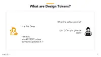
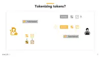
Without tokens, communication between engineers and designers can often be inefficient. For instance, an engineer might ask the designer for the color of the text. The designer responds, 'It's Flat Onyx.' This description, however, isn't immediately useful to the engineer, who needs the specific hex value. Upon request, the designer provides it: '#FFB549.' The engineer then applies this color and moves on to the next task.
A week later, the designer decides to change the color. Previously, without tokens, this would mean the engineer having to update the color in as many as 10 different places, a time-consuming and error-prone task. This scenario underscores the inefficiency of working without a standardized system like tokens.
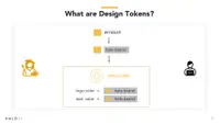
This is precisely where a token proves invaluable. The designer assigns the name 'Flat Onyx' to the hex value '#FFB549' in the form of a token. The engineer then utilizes this token in the code. If the designer later decides to change the color associated with 'Flat Onyx,' they only need to update the token's hex value. The engineer doesn't have to make any changes in the code, as the token automatically reflects the new color value.
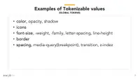
We have the ability to establish our global tokens, which serve as foundational elements in our design system. These tokens can represent a wide array of values, including colors, typography, spacing, shadows, borders, and more. By defining these elements as tokens, we create a unified and consistent set of design standards that can be easily applied and modified across our entire product.
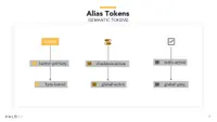
As days pass, our engineers diligently work on implementing new features. Now, we have an array of elements like buttons, toggles, and checkboxes, all styled using the global tokens. However, the designer decides that the buttons need a tweak — specifically, the text color should be changed to white. Upon receiving this update, the engineer reviews the designs and realizes a challenge. With a sigh of 'Oh my stars!' he faces the task of manually updating the styles for each button.
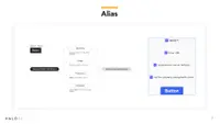
This is where another layer of tokens becomes highly beneficial. We can introduce various levels of alias tokens, such as semantic tokens and component tokens. Semantic tokens are those used across multiple components. For example, a token for text color could be applied universally. On the other hand, component tokens are specific to a single component. A token for the color of button text is a good example. By using these different token types, we gain the flexibility to either update all components universally or target a specific component for changes.
It's useful to establish a naming convention for semantic tokens, ensuring they are easily recognizable. For instance, we can incorporate aspects like sentiment, usage, prominence, and interaction into the naming of our tokens. This approach helps in quickly identifying the purpose and application of each token.
For example, a token could be named 'selected-text-default-color,' clearly indicating its use and function.
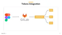
To prevent the engineer from having to manually update tokens in the code, we can utilize a tool like Style Dictionary. Our design tool, Figma in this case, can export the tokens as a JSON file and commit them to a repository. We then employ Style Dictionary to generate the tokens in the required format and automate the commit to the repository. This process simplifies the engineer's workflow significantly. They simply need to pull the latest changes, and voilà, they have the updated tokens.
Now that we've established our tokens, it's time to start constructing our components. It's crucial to clearly define each component's purpose, specifying what it is intended for and, equally importantly, what it should not be used for.
Here is another YouTube short where I talk about token layers:
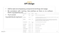
Let's delve into API design for components. What constitutes the API of a component? It's essential to define how the component is used, including its inputs and outputs. Consistency in naming is crucial to avoid confusion. A good rule of thumb is to use prefixes, which helps prevent name collisions. Additionally, it's advisable to limit the number of inputs and outputs to maintain simplicity and clarity in the component's functionality.
Avoid using functions or complex objects as inputs for your APIs. Additionally, consider carefully when to utilize imperative APIs versus those that are configuration-based. This decision can significantly impact the simplicity and efficiency of your API's interaction model.
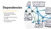
Regarding dependencies, it's advisable to limit or avoid relying on external dependencies beyond the essential framework. Where possible, consider building components in-house or using headless components. This approach helps in minimizing potential conflicts and inconsistencies, ensuring a more streamlined and reliable system
When it comes to tooling, it's beneficial to begin with the tools provided by the framework itself. These tools typically come equipped with best practices, optimizations, and backward compatibility right out of the box. Leveraging these built-in features can lead to a more efficient and effective development process.
n terms of testing, it's crucial to incorporate several key practices:
Utilize Rendering in Unit Tests: This ensures that components render correctly and function as expected.
Set Up Linting and Formatting: These tools help maintain code quality and consistency, making it easier to identify and fix errors.
Implement Template Checking: Regularly check templates for errors or issues that could affect performance or user experience.
Verify Input Types: Ensure that all inputs are correctly typed to prevent unexpected behavior or errors.
Ensure Template Safe Navigation: This helps in avoiding runtime errors by ensuring that templates gracefully handle null and undefined values.
Consistent Naming Conventions: Maintain clarity and ease of understanding with consistent naming across your codebase.
Schematics:
Installation: Detailing the procedures and requirements for properly installing the design system.
Migration: Outlining the steps and best practices for transitioning existing projects or elements to the new design system.
Generator: Providing tools or scripts that facilitate the automatic generation of components or code within the design system framework.
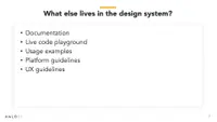
In addition to the core elements, several other crucial components live within a design system:
Documentation: Comprehensive guides and references that detail the design system's components, usage, and best practices.
Live Code Playground: An interactive environment where developers can experiment with code and see the immediate effects within the design system.
Usage Examples: Practical demonstrations of how components and elements can be utilized within projects.
Platform Guidelines: Specific instructions and standards tailored to different platforms to ensure consistency and optimal performance.
UX Guidelines: Principles and rules that guide the user experience design, ensuring that the system is user-friendly and intuitive.
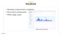
Storybook: This tool provides a unique space where developers can experiment and play around with components, without the need for local installation. It's incredibly beneficial for several reasons:
Interactive Environment: Developers can interact with components in real-time, providing a hands-on understanding of how each element functions within the system.
Usage Examples: Beyond just checking bindings and events, Storybook allows developers to see components in action, offering practical usage examples. This helps in understanding how these components behave in real-world scenarios.
Application Paradigms: It aids in exploring different paradigms of your application, such as modals, to determine the best implementation strategies.
Reusable Components: In this isolated environment, developers can focus on creating components that are not only functional but also reusable across different parts of the application. Storybook essentially serves as a laboratory for developers to test, iterate, and perfect components before they're integrated into the main application.
Key Considerations to Keep in Mind:
Flexibility Over Conformity: Avoid forcing applications to strictly adhere to your library. Allow some flexibility for specific needs and contexts.
Graceful Exception Handling: Instead of allowing exceptions to disrupt the user experience, handle them gracefully and thoughtfully.
Prioritizing Accessibility: Always remember to design with accessibility in mind. It's not just a feature, but a fundamental aspect of inclusive design.
Regular SSR Testing: Test for Server-Side Rendering (SSR) early and frequently. This helps in identifying and resolving potential issues well in advance.
Avoid Premature Additions: Be cautious about adding new features or components until there's a definitive need or use case for them. This helps keep the system lean and relevant.
Direct DOM Manipulation: Refrain from directly manipulating the Document Object Model (DOM), as this can lead to performance issues and conflicts.
As we reach the end of our journey through the labyrinth of design systems, it's clear that the challenges – the 'villains' lurking in the shadows of our projects – are formidable. They come in the guise of inefficiency, inconsistency, and a myriad of other obstacles that can thwart even the most experienced teams. But fear not, for in every story filled with villains, there emerges a hero. In our narrative, this hero is the design system we've meticulously crafted.


